Tuesday, 26 November 2013

PAPER-CUTS November 2013

Hello peeps! It's been a while I know... those that know me well will be aware that there's been some big changes in my life!! And alongside that, there's had to be some changes to Paper-Cuts.
So, for the time being, we'll be meeting on a Saturday only. Also, due to popular demand - no more kits! Instead, I'll be creating a layout (you'll still get written instructions, as before) which you can then re-create using your own, ever-growing stash.
Each month, there'll be a little something; this month you'll get the same 'love' stamp and mini heart that I've used on my layout as well as the die-cut 'love' piece. I covered mine in gold glitter - perty!
My supplies such as any inks, punches, stamps, sprays etc which I've incorporated into my layout will still be here for use. The only difference is that you get to choose which papers and added embellishments you'd like to bring along to complete your own layout. Good huh?
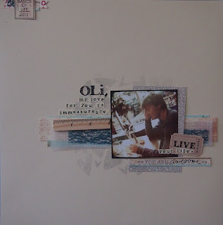
So, without further ado, here's this month's layout:


Like it?! For your reference, the photo is 4 1/2" x 3". I found this fitted nicely onto a couple of pieces of 6x6 paper used as matts, whilst allowing that beautiful die-cut piece to show. So then...see you Saturday - can't wait!! xxx

Wednesday, 19 June 2013

PAPER-CUTS June 2013

Hello ladies.... I'm going to keep this short and sweet, as I'm just about to take my hubbie out for a slap up meal! Here's this month's project:
As you can see, this month we're going for a double page spread! The photo's I've used are 3.5" x 2.5", but I'm figuring most smaller sizes would work.
Lots of cutting and stamping (surprise surprise) this month. Included in the kits are the wood veneer and chipboard pieces, but if you have anything at home that you feel would look good 'swinging in the breeze', then do please bring it along! See you this Friday/Saturday! xxx

Monday, 13 May 2013

........and a Card!

For those of you that look forward to making a card in class, here it is:
How's that for a cheery, springtime message; perfect for a dear friend! See the pretty vellum background? You'll be making that (with the help of a Martha Stewart AOTP punch)! Everything else is in your kits so nothing extra to bring/add for this one.
Righto... see you very very soon! xxx

Sunday, 12 May 2013

PAPER-CUTS May 2013 Layout Two!

As promised... second layout for the day:

Sorry that the lighting's not the best and in fact, the shot is a little blurry, but I wanted to get it loaded tonight for you! This one features a small 1 3/4" photo - simply punched out of a larger 6x6 one. When choosing your snap, be sure that there is somewhere within the shot that'll make sense as a small circular photo!!
I'm really pleased with this layout; be warned, it looks fairly minimal but actually took a fair amount of time to create! Don't worry - if you feel like missing some of the intricacies out, I think it would still have quite a lot of impact.
The only things I've added which you may wish to bring along are some small word stickers. Mine are from Authentique - they do loads of different ones... you've even got time for a little shopping before class lol! Of course, you have your alpha stickers in the kit, which would do just as fina a job.
P.S. If anybody happens to own a 2" circle punch and one slightly larger to create a mount, do please bring them along - it'll save a queue for the Silhouette!

PAPER-CUTS May 2013

Hello girls! You'll be pleased to know that I'm getting a LITTLE more organised.... here's our first layout:
The kit is Gorgeous with a capital G this month; lots of fun, up to date colours and collections. We'll be using the Silhouette to create the hearts, as always, the obligatory stamping (!) and notice those cute mist splatters? You're all going to get proficient at that too!!
I've added a few lovely bits and pieces for this layout: canvas cameras, rub-ons and washi tape. Though we do get a sheet of small alpha tiles in our kits this month, I'm afraid you'll have to supply your own larger alphas if you would like your title to look similar to mine!
OK... layout two coming up later this pm! Hope you like! xxx

Friday, 26 April 2013

Thanks For Your Patience... Here We Go!

OK peeps... two layouts for you to consider, as per the norm! Take a look at number 1:

As I said - the kit has lovely rich colours this month - quite rustic too I'd say, so bare that in mind when you pick your photos. I've added many many polaroid frames to your kits to achieve the pretty cluster  - here's a close up:

Second up; something very 'graphic' for you to work on:

This bold style seems to be very in trend at the moment, so I have to keep you up to speed hey?? We'll be cutting out the arrows with the Silhouette machine from your papers. And the journalling? Well, tht's hidden behind the photo, so you can make it as personal as you like!
Remember to bring that faithful alpha sheet we received in our kits two months ago; I've used them in both layouts - they're still going strong!
Now, lastly... I going to promise to TRY and create a card to give you the instructions for, but I still have the write up's from these two to complete... and I'm a tad er... how shall I put it... knackered (!), so please don't be too disappointed if I don't achieve what I hope!!! xxx

Wednesday, 24 April 2013

PAPER-CUTS April 2013

Hello everyone! As some of you know, I'm a proper working gal now! I will, of course be continuing with our classes (how could I not?!), but until I get myself a little more organised, please bare with me! I will be posting the layouts/projects before class this month, but it may be Friday.
In the mean time, you can see the kit by clicking HERE and I will post the two photos I will be using for the two layouts below. both are square (3"x3"). If you don't print at home, but wish to have the same finished layouts as mine, simply choose a couple of photos that you can crop down!

As you can see, the photo colours are quite 'autumnal', as the papers in the kits this month are very rich in colour.
Ok - I promise to be in touch very soon! Hugs to all. xxx

Thursday, 21 March 2013

PAPER-CUTS March 2013 Final Project

Hi guys - sorry for my tardiness! Here's our last project this month:


Killing two birds with one stone here; it's Connie's birthday tomorrow, so after giving her this card, I'll be taking it straight back for the day as our example lol! She won't know though...she'll be at school ;-)
This card comes together very quickly. The blue paper is perfect for making a card specific for a member of your family - simply pick the piece with the relevant relative on it!!
The only extras you can bring (if you have them, otherwise fear not - they will be here for your use!) is 3D foam pads and extra tacky tape.
Looking forward to seeing you all! xxx

Tuesday, 19 March 2013

PAPER-CUT March 2013 Layout Two

Here's layout two for this month:

I simply LOVE this photo of Connie! Lots of stamping on this one (surprise surprise!), as well as some creativity with texture paste; hmmmmm, am I mad letting you lot loose with that stuff?!?!
Again, I've used the alpha sheet from last month's kit - so you really do need to remember to bring it with you! 
Hope you like! xxx

PAPER-CUTS March 2013 Layout One

Hello all! Hope you're all well, and looking forward to class this month! Without further ado, here's our first project:

I have Shimelle Laine to thank for inspiration for this one; something a little different! The photos are 2 3/4" square, and you'll need three of them. As always, if you don't have square photos, then you can simply crop some to size. Just make sure you choose some that have the subject matter within a 2 3/4" square!
The printing has been printed, vertically onto a piece of card stock cut down to an A4 size. You can do this at home in advance if you like, or wait until you've finished the layout, or simply write you're journalling if you'd rather. There's also always the option of not doing it at all too!
As always, everything you'll need is here, other than the title stickers - recognise them? They're from last month's kit, so make sure you bring them along!
OK, that's it - and now on to layout two!

Thursday, 21 February 2013

PAPER-CUTS Feb 2013 Final Project

Yes I know, I know... only three projects this month, but THIS one has five little projects within it so I think that makes up for it! It's a sweet little set of notecards:


Lots of border and shape punching for this one, and lots of fun mixing and matching! You'll need 3D foam and a brown ink pad to ink the edges if you have one. See you all soon! xxx

Wednesday, 20 February 2013

PAPER-CUTS Feb 2013 Layout Two

Ok, I THINK I've got this one photoed just before the light fades!


Notice here the subtle sprayed hearts in the background using a mask - that'll be fun... and probably messy! In this month's kit, we get an entire 12x12 sheet of alpha stickers, and I thought we'd take full advantage of that by using them to journal. Now... be warned... I patiently trimmed all my letters down as I wanted them in a smaller size - but of course, that doesn't mean you have to!
Watch out tomorrow, for one, maybe two more projects. xxx

PAPER-CUTS Feb 2013 Layout One

Good morning all! Here's our first project:

As you can see, there are some lovely bits and pieces in our kits this month, including the beautiful blue lace fabric that you can see on the left hand side of this layout. I've used a 4x6 landscape photo, and because the colours in the kit are quite muted, I toned down the colours in it before printing. Perhaps, if you print at home you could try the same? If that sounds a little out of your comfort zone, try printing in sepia, or simply choosing a photo without bright zesty colours!
The frame you see is made on my Cameo, and you'll find one in your kits, so bare in mind the phrase 'smile' when choosing your photos for this one!
Right, look out for our next layout later on this afternoon... oh... and I lied to you all... the photo I have chosen to use is 3 1/2" square, not another 4x6. If you can either print your photo that size, or choose one that you can crop to that size, then great; otherwise, I think the second layout will work just as well with another 4x6 landscape shot. Decide for yourselves when you see it!
xxx

Monday, 18 February 2013

PAPER-CUTS Feb 2013

Hello girls - hope you're all well! Apologies for the lack of organisation this month, but though what we'll be making won't be up on the blog till the latter end of the week, you CAN take a look at the kits we'll be using here.
As you can see, one of the papers COULD be seen as 'Valentinsey', but in honour of those of us who don't have those kind of photos to scrap (!) we won't necessarily be going down that road!
I'll also stick to using 4x6 photos, one on each layout, so that you can at least have a look through your photo stash and choose some appropriate ones that go with the kits.
So, to summerise, watch out for some posts Wednesday and Thursday (and, if I can get my act together perhaps before that,) and I look forward to seeing you all Friday/Saturday! xxx

Saturday, 26 January 2013

Thank You But........!

Thanks for a lovely two days every one! Can i ask the everyone to check their bits and pieces for a  small acrylic stamp mount? You know the style - the thin ones with the grid lines and it's the 5" x 1" one that's gone astray.... I'd be a very happy gal if one of you lets me know it's turned up! xxx

Wednesday, 23 January 2013

PAPER-CUTS Final January Project

Ok - here's the last offering for this month girls... you can't REALLY do Valentine's without including a card, can you?


A less traditional colour scheme for Valentine's here, but personally, I rather like the fun bright colours - make's a change from red hey??
I've added a little doodling on one of the punched borders, a cute stamped sentiment from Ali Edwards and a small piece of vellum to soften the whole look.

Right then, here's a small list of things you may wish to bring along if you have them:
A back fine liner pen (01 nib).
Black and Kraft and Opaque white coloured ink pads.
3D foam pads.
Fine detail cutting scissors.
Heart border punch.
Wet glue.

As always, the above items aren't essential - everything you need is here - it just speeds things up a little!
See you Friday/Saturday! xxx

Monday, 21 January 2013

PAPER-CUTS Third Project... Heard of Mail Art??

Who's heard of mail art? Yes? No? Well, for those who haven't, in a nut shell, mail art is creating a thing of beauty and sending it through the post. 
For once, it's ok for beauty to be on the OUTSIDE - cos thats what it's all about; whether it be an envelope, a letter, or in this case, a hand created post card, the whole point is to let those who's hands it passes through on the way to it's destination see it.

So, this month, I thought we'd create some Valentine themed mail art:


This is the front, and here's the back:


Mail art can, of course be far more complicated and artsy than this... but hey... I'm sure this post card will gets some smiles alongs it's way!

PAPER-CUTS January - Second Project

Another layout (of course!), this time with a little more of that pink in it that I mentioned:


Lots of layers in this one... including vellum, wood veneer, and some punched border details. I adore that sweet little polka dot envelope, and it's the perfect place to hide some journaling too. Do you see those sparkly splatters? That's the Tinsel (silver) colour from Heidi Swapp's new Color Shine range of mists; I have to say they're the best mists I've ever used - go get some!!!

The photo, again, is a 3"x 5", though this one is oriented in a landscape fashion.

Hope you like! xxx

Sunday, 20 January 2013

PAPER-CUTS January 2013

This month's kit is, perhaps obviously, themed on the romantic side! You can check it out here. So, without further ado, here's our first project:


With February just around the corner, I just had to take the opportunity to use a photo of Rich, didn't I?!?! There's quite a lot of pink in the kit, but with this layout, as you can see, there's no need for things to get too girly!
Note the doodling around the edges of the layout and along the punched borders. Because this is quite a simplistic format, the doodling helps to keep the finished piece from being TOO minimal. Here's a close up of the large chipboard heart:


It has a resist finish on it, giving that pretty chevron pattern. Cute! For those of you wanting specifics, the photo is 3"X 5", and the doodling pen has a 0.1 nib. Right... project 1 up for your perusal... watch out for project 2! xxx

Monday, 14 January 2013

New Bigger and Better Scrap365 Out This Week!

Just to let you know that the March edition of Scrap365 is out this week - do make sure you grab your copy! It's fatter than it's ever been before!

Tuesday, 1 January 2013

Happy New Year!

A very happy New Year to all those that read my blog! Just wanted to let you know that the January Papermaze kit is up on their blog for your perusal... you can find it here. xxx